
HUNGRY NOW
Food ordering platform that works to fit everyone needs


Overview
One of the most concerns of food delivery app users is delivery fee. After they finally find food they would like to order, but later they find out that the delivery fee is higher than expected. This makes them have to go back to the food search process again.
This project is to improve user experience by allowing users to search restaurants by the maximum delivery fee of their choice.
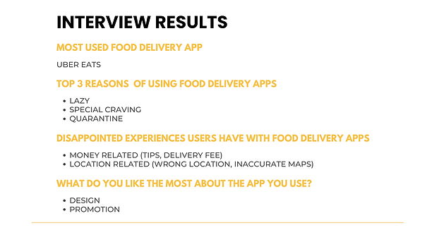
Interview users to explore problems
5 international students in Vancouver were interviewed to learn about their food delivery app usage experience. Below are the summary of our findings:

User Journey
After user interviews, we created a user journey with questions users may have in each step which later translate to users’ pain points.

The most mentioned pain point from our users is money-related problems - delivery fee. We defined the “How might we” statement of our user problem as:
“How might we design a food delivery app for users in order to help them relieve the delivery fee concern”
Solutions
My teammate and I then went through a brainstorming session and came up with ideas to solve the user problem.
1. Tell users why the delivery fee is this rate.
2. Users can search by delivery fee then the system shows restaurants within the radius.
3. Inform and compare delivery fees from competitors' apps
We applied Prioritizing map to decide what features to build for our product. We agreed to discard the idea of informing competitors' delivery fees.

User Flows & Sketch
Based on the insights from the interview, user pain point is during the search for food process. We create a user flow to understand step by step of this process.

Each of us sketched our ideas based on the user flow, then presented them to each other.

Because we already had a clear understanding of the functional requirements for our product since the brainstorming session, we had similar ideas for the search by delivery fee feature. To justify for the differences in our ideas, we compared our sketches and discussed which design will be easier for users to perform the task.
Wireframe
We created 2 flows of wireframe for users to access to the ‘search by delivery’ feature
Flow 1: users click ‘search by delivery’ icon directly

Flow 2: users click through ‘search’ function on tab menu

Usability Test I
We did our 1st usability test with 5 users. Our task is “order food with $ 5 delivery fee” Below is summary of our findings:
Homepage
1. None of the users click the 'search by delivery fee' icon on their first try
2. Only one user clicked search at tab menu
- The icon is not noticeable
- Users have a habit to scroll down the homepage to check for food first

Search feature
1. Users got confused when there is "no result" on 'search by delivery fee' page
- The slider bar starts with $0 delivery fee by default

Iteration
Homepage


Changed from recommended restaurants to popular genre - align with users' behavior to scroll down food photos first, then later can search restaurants in the category by delivery fee
Make helping text more noticable
Search feature


Move ‘Why do I have to pay delivery fee?’ from homepage to search page
delivery fee starts with a minimum fee in the area instead of $0, the result will expand simultaneously when the rate increase

change the delivery distance to delivery lead time. Some users are willing to pay more if they can get food faster

Usability Test II
After iterating our design, we conducted the 2nd usability test for the same task again with 3 users. As a result, the process went smoother compared to the 1st time. 100% of the users were able to complete the task in their first try
The icon for ‘search by delivery fee’ feature is more noticable for them
Even they follow their habit of scrolling homepage to explore food first, they still can select restaurants based on maximum delivery fees
They are not confused with ‘no result’ on the search page
Hi-Fi Design
Define a style tile

Color: We selected red as the primary color as the color is effective to boost human appetite. Other colors in the pallet are selected from the tempting-looking food - the burger.
Font: We chose San Sarif type - Lato as it has a clean and easy-to-read style. It has thin look which makes the app not look too content-heavy. The typeface also has various styles for us to select and create a proper hierarchy for the information.
Mock Up


Conclusion
Although we have a clear and straightforward solution for users' pain points, it is also important to take user behavior into consideration when it comes to product design.
In our case, the search by delivery fee feature is simple and easy to understand for the task we gave to our users during the usability test. However, we noticed the habit that most users have in common - scroll down the homepage to check food photos first. This led us to adjust our homepage and website structure to make our feature more accessible.
Based on our interview in the usability test, all of the users found that our solution idea is creative, useful, and definitely will affect their behavior if it was available in a food delivery application.